IN THIS ARTICLE
Subscribe to Our Newsletter
For a long, long time, our data has been static. Data is updated when we ask it to be, whether it’s querying and inputing new data, refreshing a page, or drawing a new bar graph.
But that was yesterday.
Today, with the emergence of data streaming, we now have realtime data functionality at our fingertips. Our data is now alive. Data is streamed, processed, and visualized as it happens. Line charts and bar graphs update themselves. Immersive, interactive visualizations creatively display fresh data as it streams. When it comes to how we display our realtime data, the sky’s the limit.
What is a realtime visualization?
A realtime visualization is the processing and publishing (visually) of any type of data is it changes, in realtime. Some examples:
- Line chart that draws itself
- Bar graphs changing heights
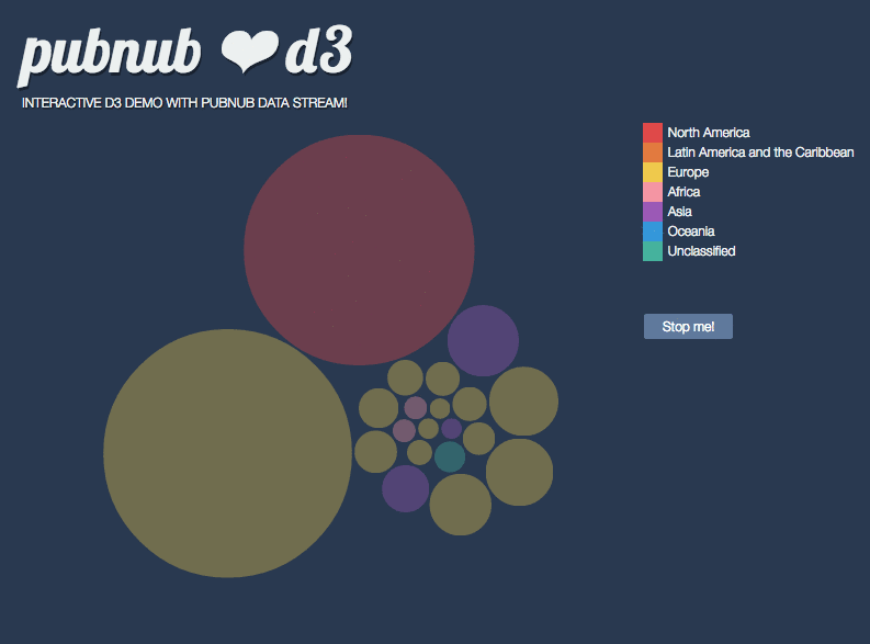
- Bubble chart with varying sized bubbles
- 3D Earth with lines showing messages being sent
- Heat maps based on twitter traffic
- Changing lights based on voting
The video above has a good number of examples in action, so check it out!
How do we build realtime visualizations?
At its core, a realtime visualization is made up of two components: a stream of data and a user interface.
- Stream of Data
A stream of data is a constant flow of data where data packets is sent whenever that data is updated. This could be weather forecasts, stock prices, revenue, or Tweets, pretty much any data group that changes over time. Because a stream of data is active, it needs to have persistence, an open connection that allows data to be transferred freely.
If you want a tutorial on how to turn a source of data into a stream, we’ve got a good one here.
- User Interface
A realtime visualization requires a flexible, interactive user interface where changes are easily displayed based on changes sent from the stream of data.
What technologies do we use?
To build a user interface that reflects changes to a stream of data, you can use one of the many programming libraries out there. Two well known JavaScript libraries that can be used for data visualizations are D3js and WebGL.
D3js (Data-Driven Documents) uses digital data to drive the creation and control of graphical forms entirely in a web browser, which goes hand in hand with realtime visualizations. It enables you to make beautiful and easy to understand data visualizations.
WebGL brings 3D to the browser, which means we can build some amazing visualizations outside the two dimensional realm. When we bring WebGL to the cloud, we can then stream data to a WebGL application to create some pretty interesting in-browser 3D visualizations.
If you want to see some examples, check out our list of D3js and WebGL visualization tutorials.
What’s the value?
Old data is bad data. And for a business, up to date data is essential. Visualizing that data and making it easy and clear to understand is key for business decisions and makes monitoring that data more streamlined. An operations team can monitor their systems or networks and spot trends or issues. A financial team can have accurate, up to the millisecond financial data.
But it doesn’t just stop with strictly business. From a marketing standpoint, you can display trends, social mentions, etc, and display them for anyone to see. For second-screen and entertainment experiences, you can display poll and trivia scores as more players interact.
Realtime visualizations have even found their way into art, where two visualization artists created a data-driven performance where a series of questions were asked to an audience, and based on their responses, a projection on a public facade changed. Read more about the artists and their project United Colors of Dissent here.

Data-driven performance United Colors of Dissent creates a realtime visualization based on audience answers, and visualizes results on public facades.
Immediate data visualization is changing the way we look at data. Current data is smart data, and the how he process and visualize data is getting smarter.
Building a HIPAA-compliant App