

IN THIS ARTICLE
There’s an endless number of factors can influence the efficiency of your operation. Say you’re operating a massive public transportation system; unpredictable events like weather play a huge role in how well your system runs. We need a way to collect and visualize these patterns, and make business decisions based on them.
In this tutorial, we’re going to use the NVD3 library to build a small app that visualizes bus data in realtime. We’ll use PubNub Pub/Sub messaging to collect and stream the data, and animate our charts in realtime.
NVD3 Data Visualization Project Overview
The concept is simple: we’re going to receive realtime data from bus drivers. The data will contain the delay at a given time, as well as how many inches of rain fell over the last 6 hours. We will plot the data on a bubble graph to visualize it. At the end of this tutorial, you’ll be able to build your own realtime web visualizations from streams of data.
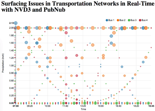
Here’s what the end product will look like:
Enough talking, let’s get right into the code.
NVD3: The Window To The Data
We are going to start by making a basic HTML view. Feel free to make it as beautiful as you like, we will make as simple as possible to allow you to be as inventive as you wish.
Getting Started: Necessary Imports
Our webpage will have a NVD3 graph, so you want to import both the d3 and nvd3 libraries. Don’t forget to add the css for nvd3!
HTML
We want to add a div containing our graph. Make sure you set the height. Simply give it an id and put the good old svg tag in there for graphics.
Add The Graph With JavaScript
Our JavaScript file will define how our graph is setup. We will create a chart, format the axis and put on screen!
We generated a chart by defining that it would be a scatter/bubble type chart and added color. We format the x and y axis by putting in labels, and defining how the ticks should appear. The “d3.format(.02f)” indicates the precision of the float that will appear on screen. Note that for the y axis we passed in a custom method, we will see how this was implemented later in the tutorial.
Finally we add the graph to the page by passing in this function:
We point which svg should hold our graph by passing the id of our div, we add the data which we want to plot, set the duration for the transitions in the animation and pass in the previously initialized chart!
At this point we don’t have any data. However, this is the format it should have:
It’s basically an array of key-value pairs. The key identifies a series of points which will all have the same color on our graph, the values hold an array of points defined by their x/y position and the size of the bubble on the graph. Logical, easy, but you have to know how to format your data.
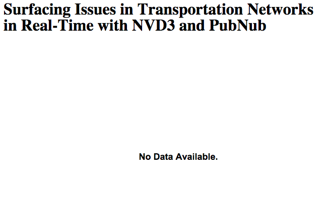
At this point, we got our graph to the screen. If you run your app right now, your graph will be replaced by a big “No Data Available” message. We’ll have to rectify that. We will be receiving data from PubNub! Before we get in to it, let’s initialize our data:
Now let’s get to the real stuff, where the magic happens: PubNub!
Implementing PubNub in JavaScript
First things first, let’s import the library to our HTML!
The next thing we need is to initialize a PubNub instance. You’ll first need to sign up for a PubNub account. Once you sign up, you can get your unique PubNub keys in the PubNub Developer Portal, and input them in the code below.
In order to communicate with other computers and devices, we subscribe to a PubNub channel and send messages on it.
Side Note: PubNub Channels
You can picture a PubNub channel like a room. People can enter or leave the room by subscribing or unsubscribing to the channel. Whenever someone wants to talk in the room, he/she publishes a message which will be heard by anyone subscribed to the channel. A PubNub message can be a JSON object for example.
People subscribed to a channel are also notified whenever someone enters or leaves the channel. Pretty simple system. The nicest thing about it is that any device with an internet connection can subscribe to a PubNub channel; Android phones, iPhones, browsers, Tessels… perfect for connected objects! In our case, it’s simply a browser. There are SDKs for a bunch of language, check them out if you are curious.
You guessed it, we are going to subscribe to a PubNub channel where we are going to receive the data sent by the bus drivers!
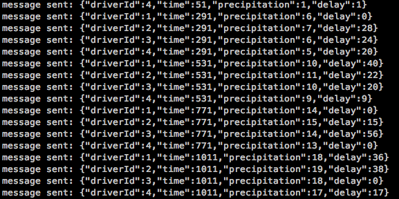
We subscribe to the channel and define a function which will be called every time we receive a message. We decided to create a method called pubnubCallback which will handle how to use this message. We’ll get into that in a minute. But first, let’s look into the format of our data.
As mentioned before, we like using JSON objects. It will hold information on which driver is sending the data, the time, the precipitation and the delay:
Note that we decided to send the time as minutes. This allows us to easily compute data over an entire week.
Now that we have received our message, we pass it to our method:
We generate a point, and pass it to our data for our given driver. But that’s not all folks! We need to add the data to the graph. We simply reload our graph. Cool animations will happen too…
Finally we need to format our minutes into a readable time. Remember how we initialized our axis? We passed in this method:
We generate our date, and format it. You could be passing actual timestamps, the process would just be the same. The key element here is to see how d3 allows you to format a date into a time.
And I think our code is done! We got our app receiving PubNub messages, storing the data in memory and updating a beautiful NVD3 graph!
Let’s check it out!
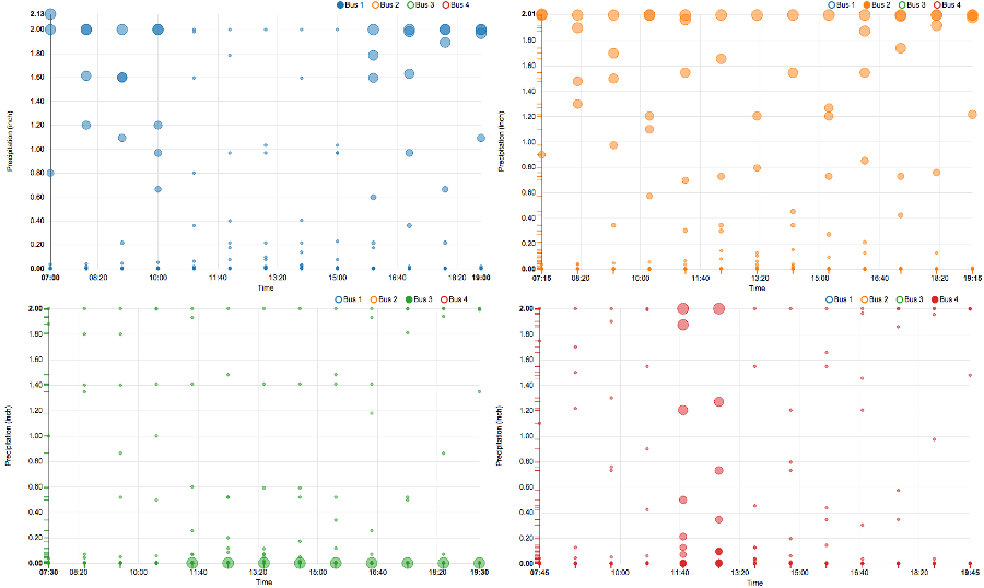
Now that we received all of our data from our bus lines over a few days, we can analyze the information! We have data on about 12 days, and only one where it did not rain. Horrible weather!
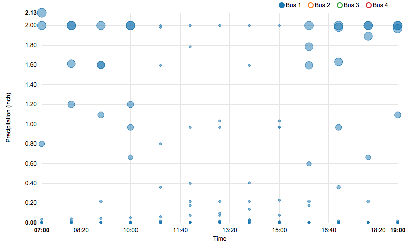
Let’s start with line 1 (blue). From what we can roughly see from the graph, line 1 only gets delayed when it rains. But if you take a closer look, we can see that this only occurs early in the morning or in the late afternoon. From 7 to 9am and from 4 to 7pm, the bus 1 is not efficient when it rains. The combination of rain and rush hours is not great.
This tells you a lot. You wouldn’t want to have more buses at these hours, they’d still be all late. You may want to consider taking different routes on rainy days to avoid the traffic that builds up from the weather!
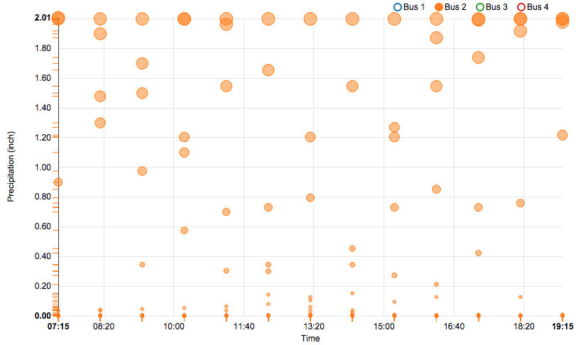
Bus 2 is always late when it rains… It’s probably worth having more buses on the line when the weather is not in your favor!
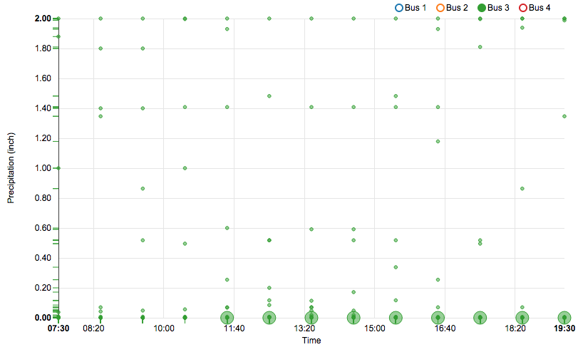
The line 3 is working pretty well! Hardly any delay, except on that one day. This maybe the effect of random event, like an accident on the road. There’s only so much you can predict!
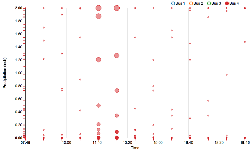
Finally line 4 has been consistently late around noon, regardless of the weather. Taking a different road may be more effective. Maybe the drivers need their schedules to be organized so the lunch break does not disturb the planned bus schedule!
We’ve got a ton of realtime visualization, charts, and graphing tutorials using a wide variety of frameworks, so check them out!
Try PubNub today!


