IN THIS ARTICLE
Subscribe to Our Newsletter
Create realtime graphs without code! With PubNub’s Project EON you can create realtime graphs that update when you publish data over PubNub. EON works with any of the 70+ SDKs available. Check out our libraries for Javascript, Python, Ruby, and Arduino.
If you need help getting started with EON, check out our other blog posts about the EON real time maps and charting library.
Today we’re happy to announce the EON Chart builder, an interface for easily building realtime charts using the EON framework. No coding required! Take your existing PubNub stream and create a real time chart by following the steps below.
Getting Started with The EON Chart Builder
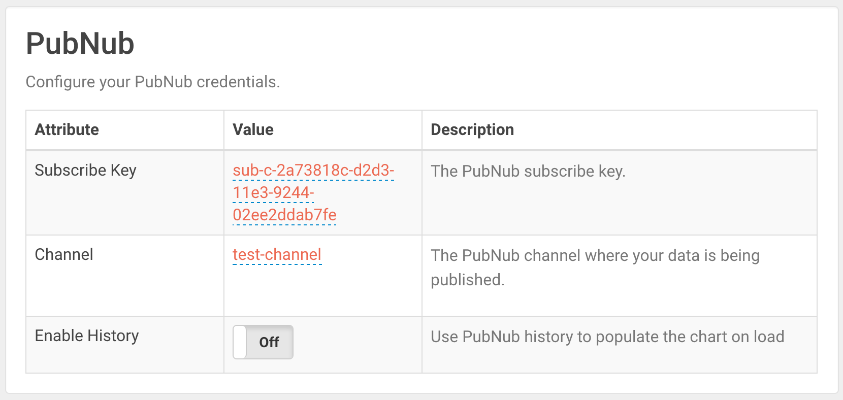
When you first load the EON builder page, you’ll notice some information has been filled out for you already. The EON Chart builder uses a preset subscribe key and test channel to help you get started fast.
If you’d like to work with your own data, click on the subscribe key and enter your own PubNub subscribe keys. You’ll also want to supply your own channel in the second row.
If you have PubNub history enabled on your account, enable it within the third row. This will populate the chart when it loads, displaying the last x data points.
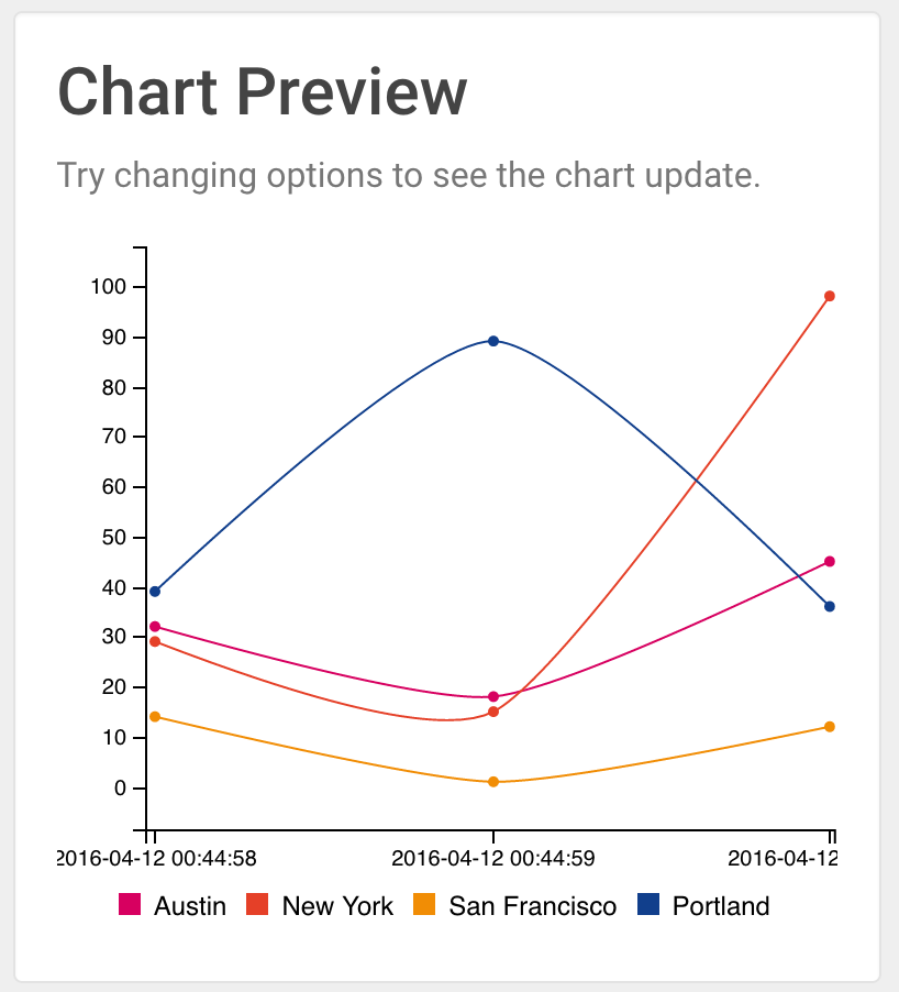
You’ll see chart data appear in the chart preview at the top of the page.
Select data to graph
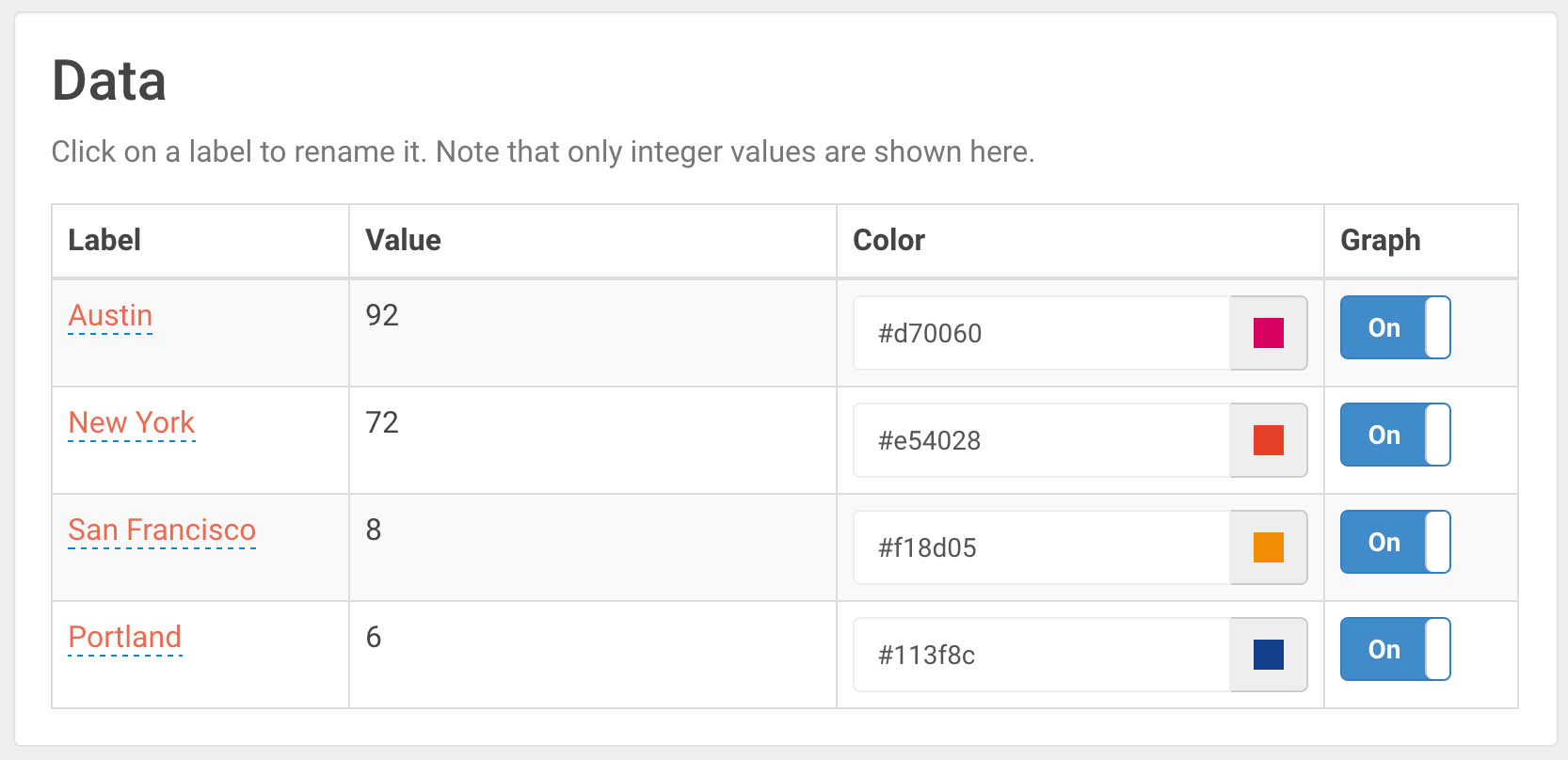
Data getting sent over the PubNub network through the supplied key and channel will appear within the Data table. EON Chart builder only works with integer values, so any text values will not appear.
The first column contains the name, the second contains a preview of the data being sent over, the third column chooses the data color and the fourth columns allows you to disable graphing that data altogether.
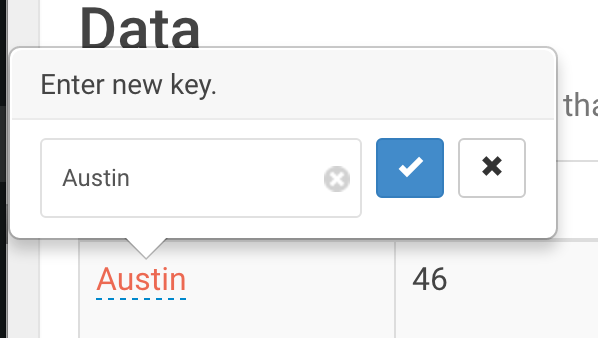
Click on the label text to change the label, then hit the checkbox to save.
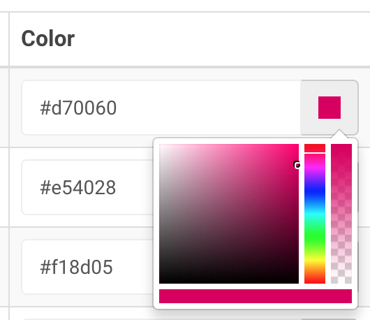
Click on the color block to choose a new color for your graph. You’ll see the color update live on your EON graph. You can also supply a raw HEX value for your data color.
Configuring the chart
Now for the fun part. Configure your chart using the tools in the next section.
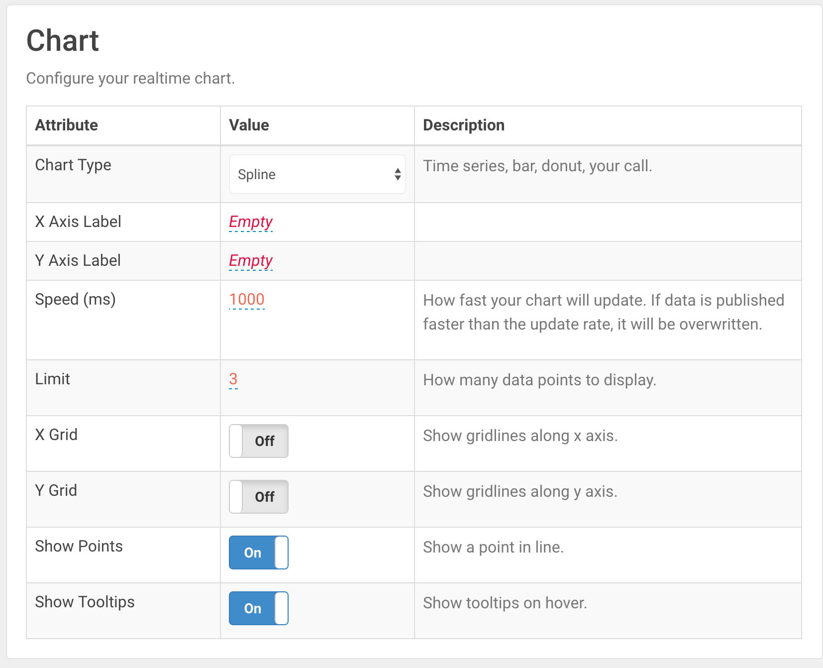
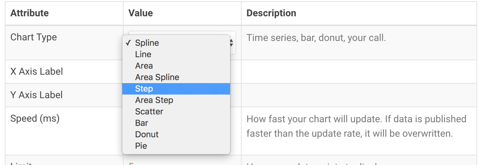
The first row allows you to change the chart type. The selection includes spline, line, area, scatter, bar, donut, and pie.
- Scatter charts plot points on a time series chart
- Line charts connect one point to the last to demonstrate change over time
- Spline charts are like line charts with the addition of a curve to demonstrate velocity
- Step charts are like line charts without data interpretation between points
- Area charts fill in the bottom section and help show contract between data sources
- Bar charts show the relation between data at every time point
- Pie charts show the relation between data in a percentage base
- Donut charts are pie charts with a hole in the center
The next row allows you to label the x and y axis on the chart. The x axis is most commonly “time” or “date.” The y axis is up to you!
Speed is the rate at which the chart updates in milliseconds. If you’re publishing data slowly, you can leave this at 1000ms or even slow it down. If you’re publishing many messages very fast, you can lower the speed (try 100ms) or increase it to allow points to accumulate before redrawing the graph.
If PubNub messages are received in between updates, the chart will queue the points and draw all of them on the next update.
Limit is the number of x values shown on the graph. Enabling history on your chart will populate your graph to the limit, thus “filling” it.
XGrid and YGrid add dashed gray lines along incremental data points on their respective axis.
Show Points add small circles to every point. This only applies to time series charts (spline, line, et).
Show Tooltips shows a popup on the chart detailing chart values where the mouse is pointing.
Embed Your Chart
Once you’re happy with your chart, it’s time to embed it on your own page!
<link type="text/css" rel="stylesheet" href="https://pubnub.github.io/eon/v/eon/0.0.10/eon.css" /> <div id="chart"></div>
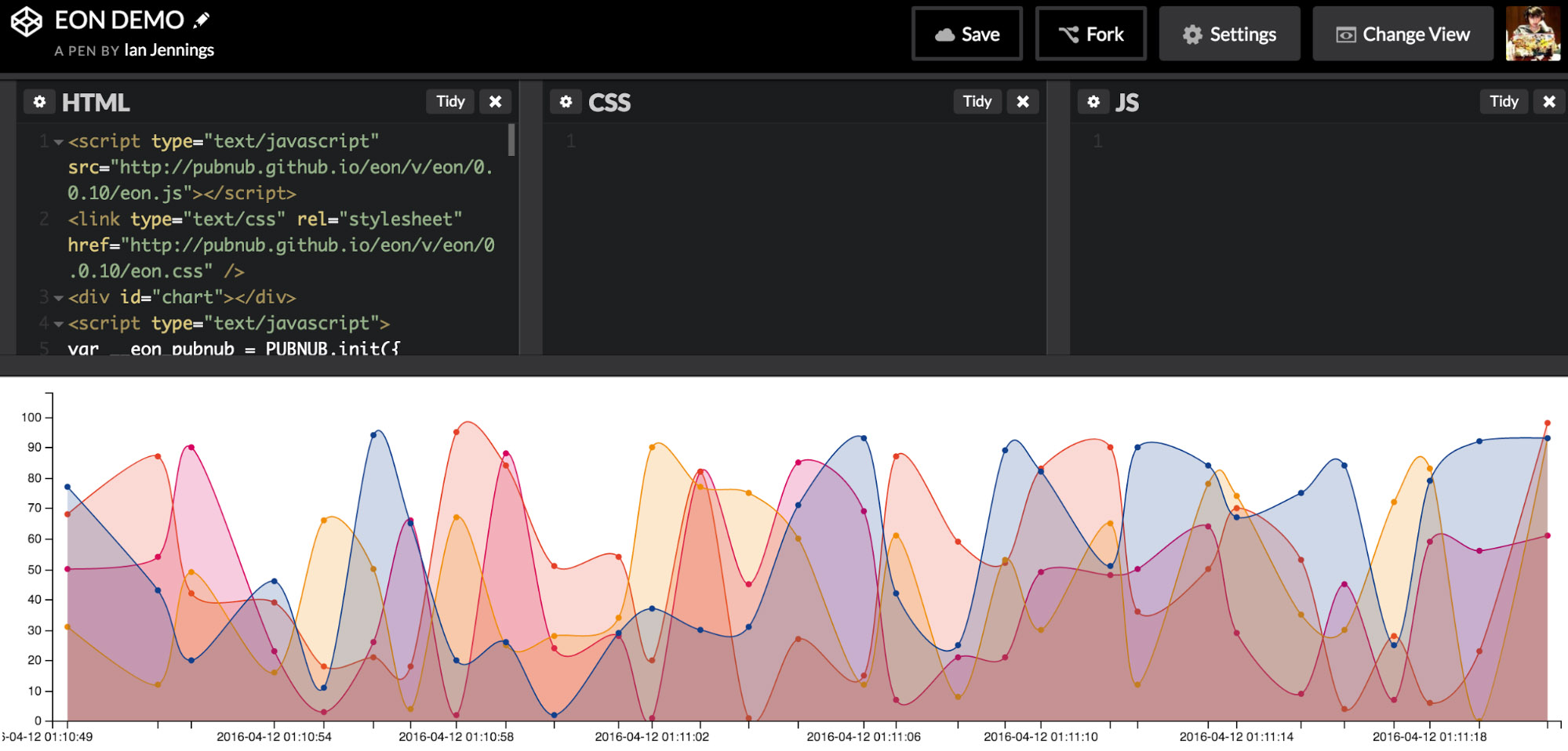
You can copy the code supplied within the Embed section and paste it in a new HTML file or CodePen. Try using a simple grid system to embed multiple charts in a full dashboard!


